UX Research · Responsive Web Design
A WhatsApp-first storefront for a power tools dealer.
Shree Hanuman is a real dealer in Navsari that had never been online. I designed a 14-page catalog and inquiry site where every purchase ends in a WhatsApp message to the owner, not a checkout, because that is how this trade actually buys.
My role
Sole designer. Research, flow, wireframes, all 14 pages.
Scope
Brief to final responsive screens
Type
Client project
Status
Concept — not yet launched
01 · Context
Every sale started with a phone call to ask what was in stock.
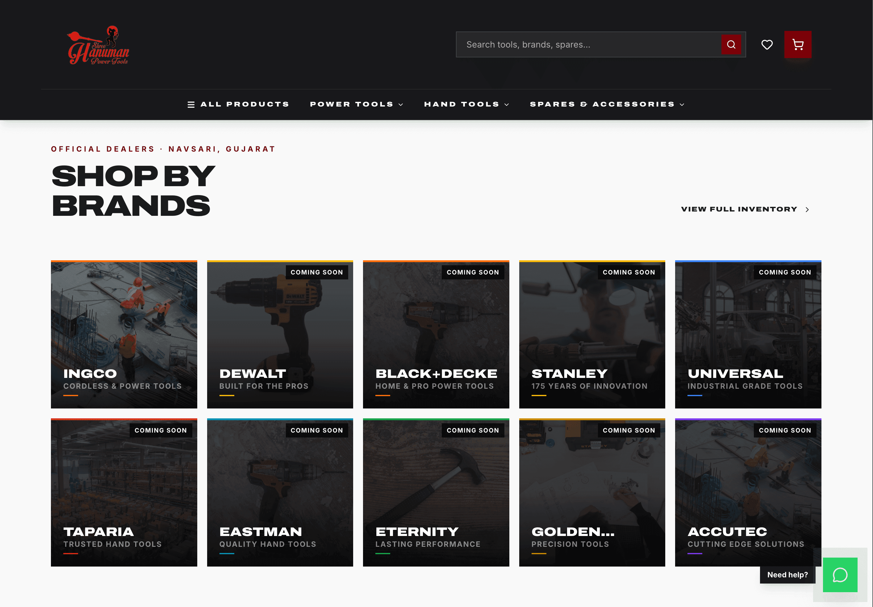
An official dealer for INGCO, STANLEY, DEWALT, Black+Decker, Taparia and Bosch, running its own repair workshop since 2018, with nothing online. The owner answered the same price, stock and compatibility questions all day on WhatsApp. First-time buyers had no way to tell this shop from any other listing, or to know it was authorized.
The obvious brief was an online store. The obvious brief was wrong, and the research is what showed that.
What the brief asked for
A catalog browsable by brand and by tool type
A way to ask about price and stock
Repair services placed front and centre
Visible proof of authorized dealer status
01.5 · What the ask hid
The ask was “an online presence.” The shop floor said something else.
The ask
Vague and general: get the shop online. No spec beyond that, no fixed idea of what the site should actually do.
What I found
No formal study, no interviews scheduled — time spent in the shop instead, watching how the counter actually worked and listening to real customer conversations as they happened. Informal, but it was the research.
Customers already bought this way over WhatsApp. They just didn't trust it as a place to pay — not the way they'd trust something like Google Pay.
That gap, not a generic love of haggling, is why a checkout button was the wrong answer. The channel was already right. The trust wasn't there yet.
02 · The reframe
Build an inquiry, not a checkout.
Customers already trusted WhatsApp for the conversation, not yet for the payment. That single gap killed the store idea. The flow ends in a WhatsApp handoff to the owner, because that is where trust closes in this trade — the interface just has to get the conversation started. Five assumptions had to go first.
Customers want to complete the purchase online
This trade confirms price and stock before committing. An inquiry fits the behaviour better than a cart.
WhatsApp is a secondary channel
It is the primary channel for this shop. The site should feed it rather than try to replace it.
Showing fixed prices builds trust
Prices anchor the conversation, but this category negotiates. The number opens the talk, it does not close it.
Authorized dealer status can be assumed
It has to be stated, with the brands named, on every page that sells something.
Mobile is the primary device
Treated as the design constraint from the first wireframe, not as a breakpoint added later.
03 · What I owned
I mapped the whole purchase, including the parts that leave the site.
The interesting decisions were in the flow, not the pixels: where the purchase starts, where it hands off to WhatsApp, and what happens when it breaks.
The handoff
Cart becomes a pre-filled WhatsApp message to the owner. No payment gateway, no account. The message carries brand, model and quantity so the reply is one line.
The edge cases
Out of stock, cart abandonment, and no customer accounts. Each was mapped as its own path, not left to fail silently.
The two axes
Navigation is organized by brand and by trade, because people arrive knowing a brand or a job, not a product code.
The purchase flow, end to end
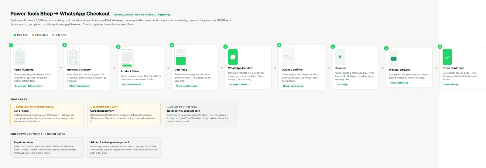
Home, browse, product, cart, WhatsApp handoff, owner confirmation, payment, pickup, confirmed. Three edge cases and two side flows (repair services, catalog admin) mapped alongside.
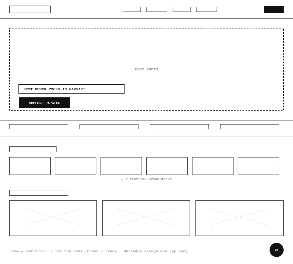
The homepage's structure — brand rail plus the two nav axes — reconstructed as a wireframe for this case study, not an original sketch.
03.5 · Self-critique
No usability testing happened. This is where I tested myself instead.
The client paused before build, so no one has used this yet. What follows isn't a usability finding — it's the first version of the cart, and the reason it didn't survive.
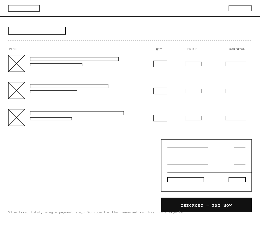
V1 — traditional cart
Line items, a running total, a checkout button — the pattern every e-commerce cart uses. It quietly asked the customer to trust a payment step nobody had used with this shop before.
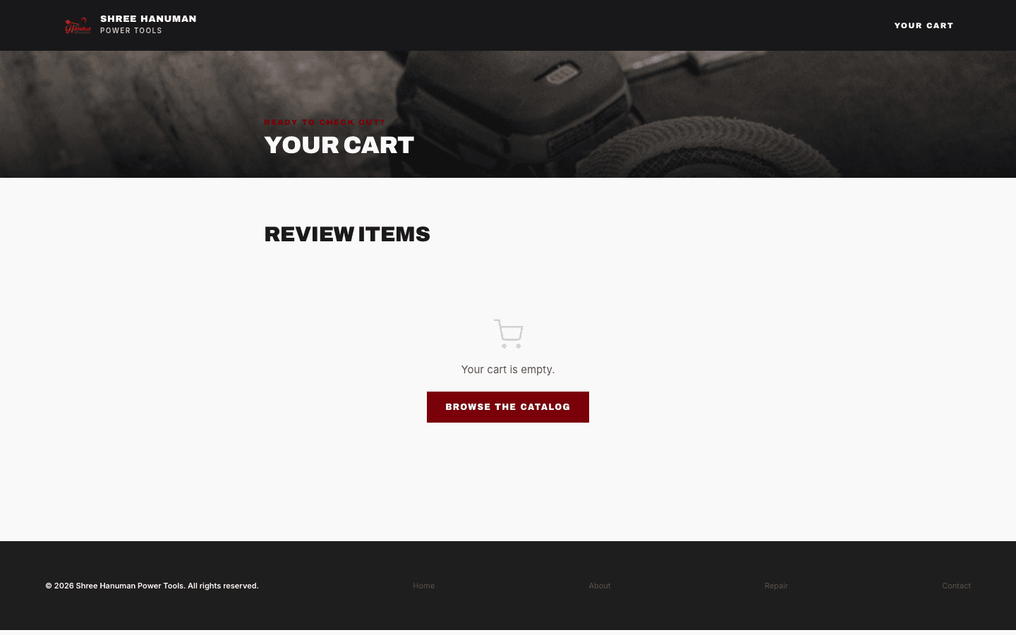
V2 — WhatsApp handoff
Same cart contents, different exit: a pre-filled WhatsApp message to the owner. The price stops being a payment demand and becomes the first line of a conversation, in the channel customers already trusted.
The wireframe is reconstructed for this case study to document the structure that got rejected — not a contemporaneous sketch from the project.
04 · The solution
Authority without shouting, across fourteen pages.
Consumer retail signals trust with softness. This category reads a different vocabulary: precise, heavy, local. I locked a system (zero border radius, a near-black base, WhatsApp green reserved for exactly one button) so fourteen pages held together without a new decision on each.
None of that was a style preference. It came from looking at Stanley, DeWalt and the other brands this shop actually sells — that vocabulary is what the category already trusts, so the dealer's own site had to speak it fluently, not soften it.
Détails — the full design system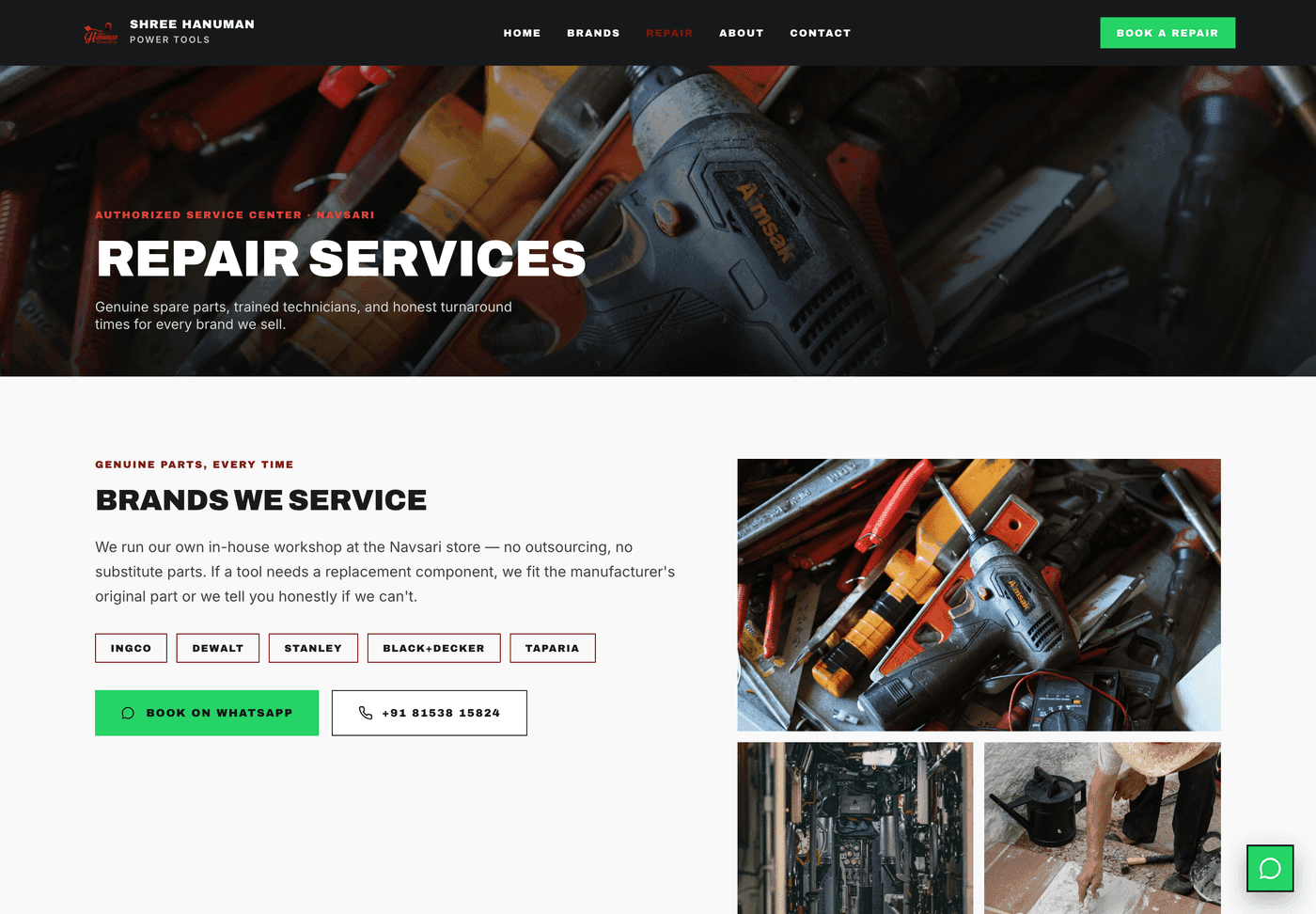
Repair services: genuine spare parts, trained technicians, one WhatsApp call to action
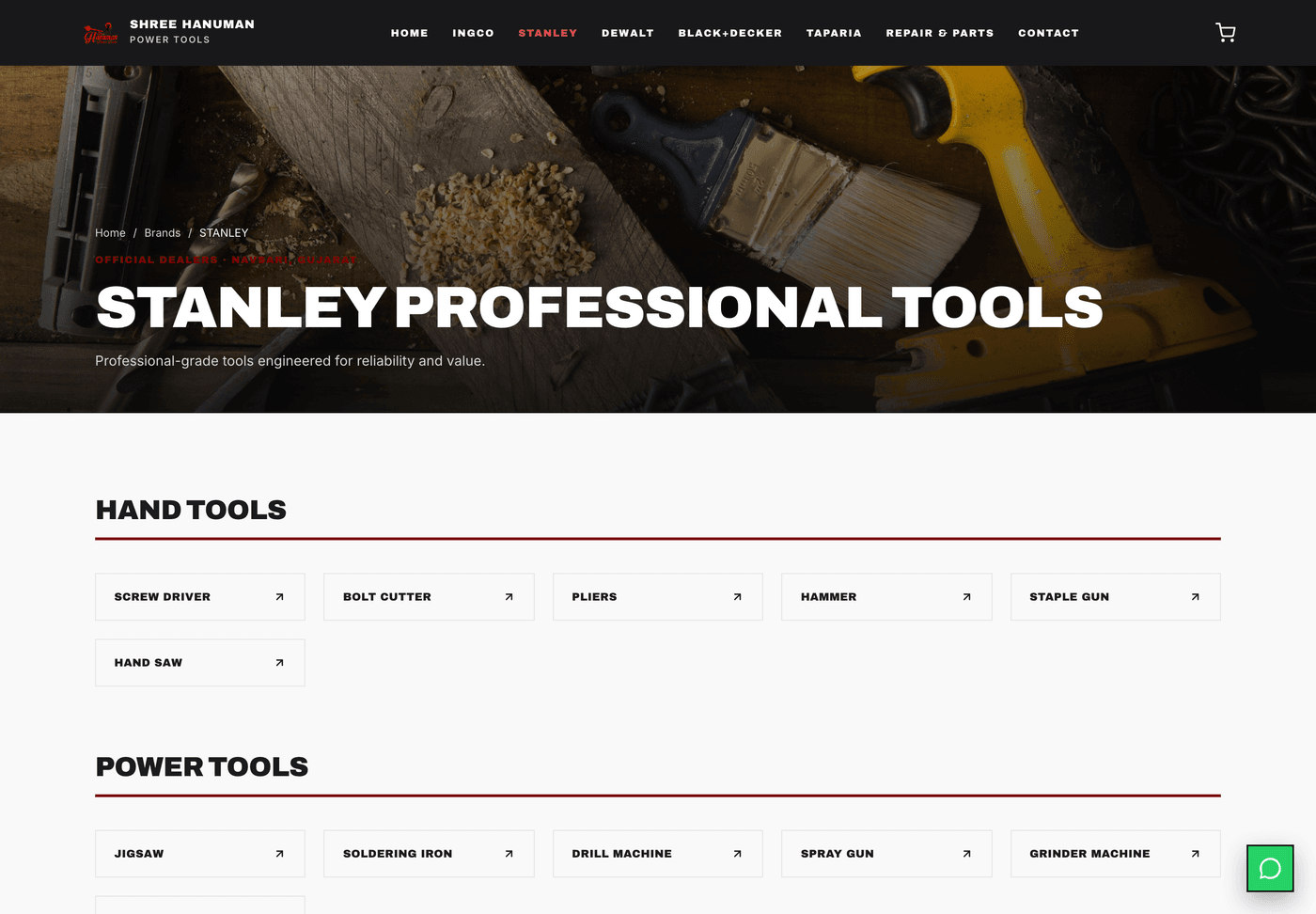
Per brand catalog: one template, six brands
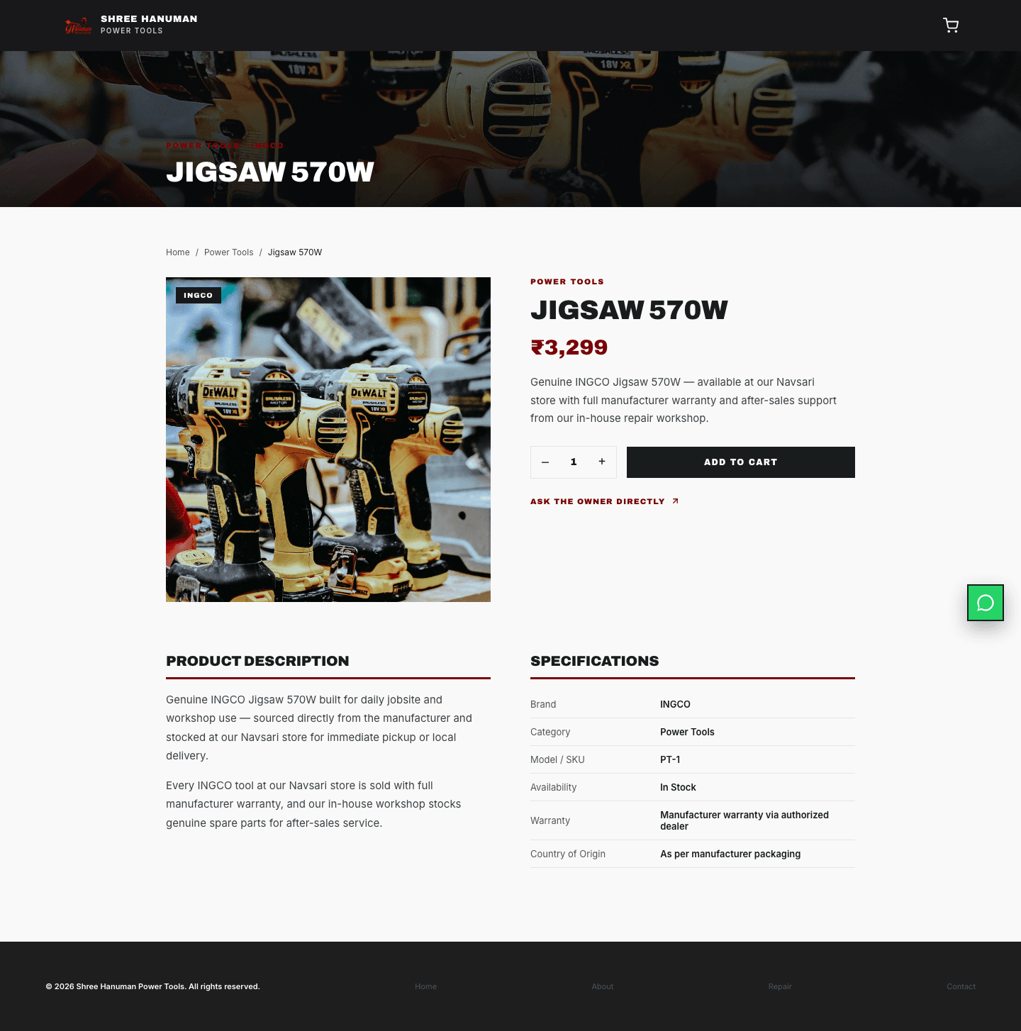
Product detail: price anchors the talk, “Ask the owner directly” starts it
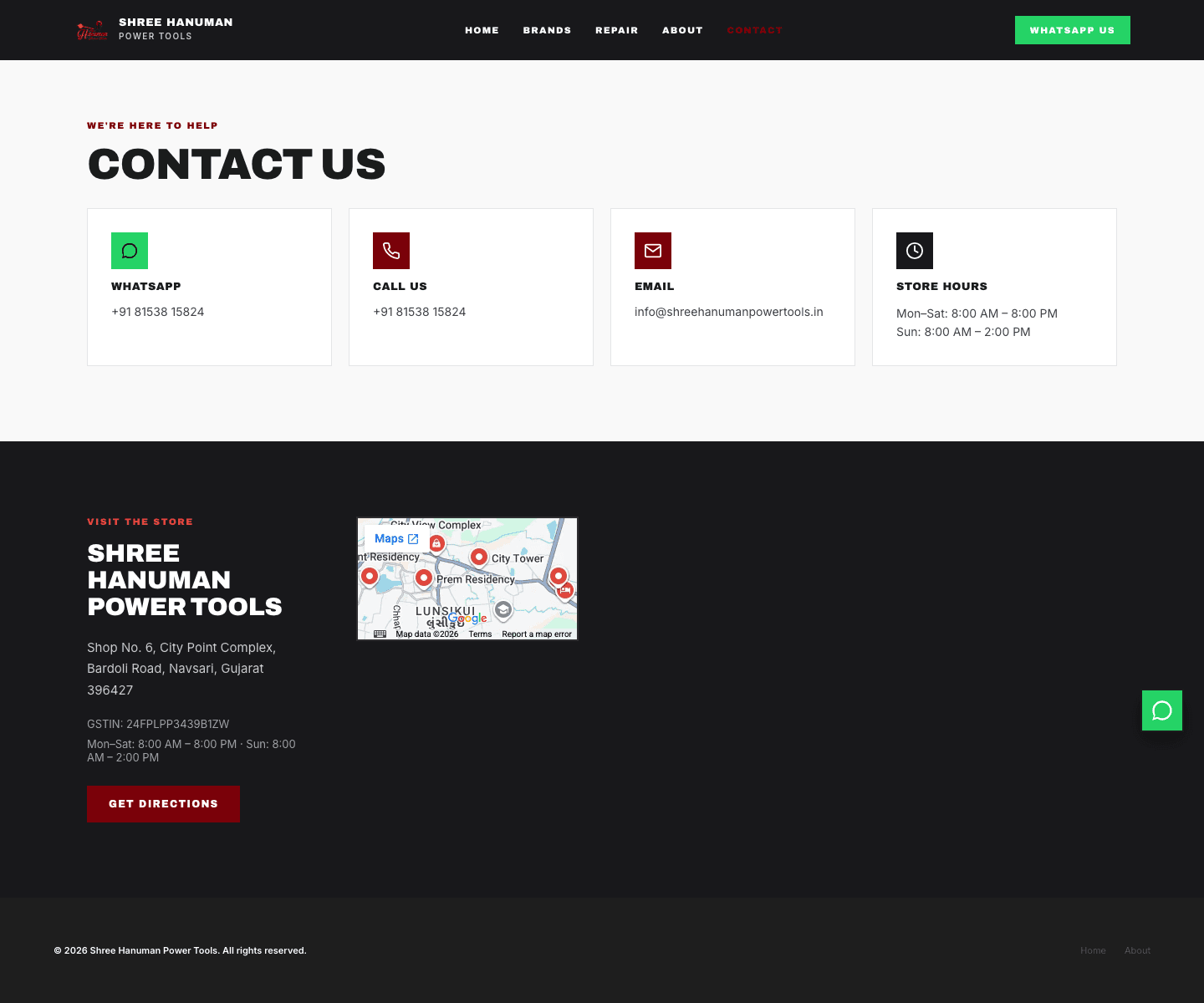
Contact: address, GSTIN, store hours and map, stated plainly
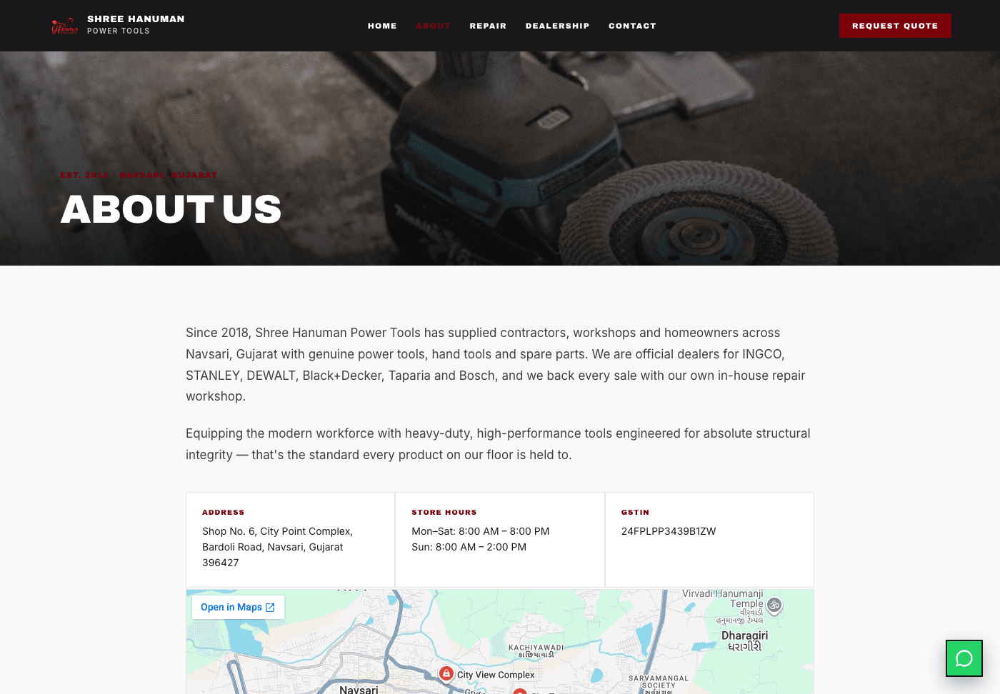
About: since 2018, address, store hours, GSTIN. Trust is stated, not assumed
05 · Outcome
14
pages designed
Every template from home to cart to the per brand catalogs.
9
steps in the flow
Including three mapped edge cases and two side flows.
5
assumptions challenged
Three rejected, one partial, one adopted as a constraint.
The client paused before build, so this is a concept, not a shipped product — no customer has used it yet. The research, flow, and full désign are ready if the shop picks it back up; what remains is backend and real product data, both outside this scope. The trust gap changed the job of the interface: it is not there to close a sale, it is there to start the right conversation so the answer takes one message.
Next project
Repair Hub
Product Design & Build →A repair-shop system that files itself. Live and in daily use.