The Short Version
Three numbers if you have ten seconds. The full story sits below.
95%
Less admin work
Six manual steps per repair collapsed into one status change.
0
Duplicate records
A live cache plus name cleanup wiped out every duplicate profile.
1 week
Idea to launch
Designed, built, and shipped inside the tools they already owned.
Hired for one project.
Fixed a more urgent one first.
Hired for a brand project, I spent week one watching the shop work. The same scene kept repeating: a repair finishes, then five minutes of copy, paste, and search just to file it.
The most expensive friction is the kind nobody complains about. I fixed it first.
The workflow before I touched it
Technician marks the repair complete
Copies name, phone, and machine details by hand
Opens a separate archive page
Searches for the customer, if they exist
wasteCreates a new card or scrolls the old one
wastePastes, formats a row, deletes the original card
wasteThe most dangerous UX debt is the workaround nobody complains about, because they already forgot there was a better way.
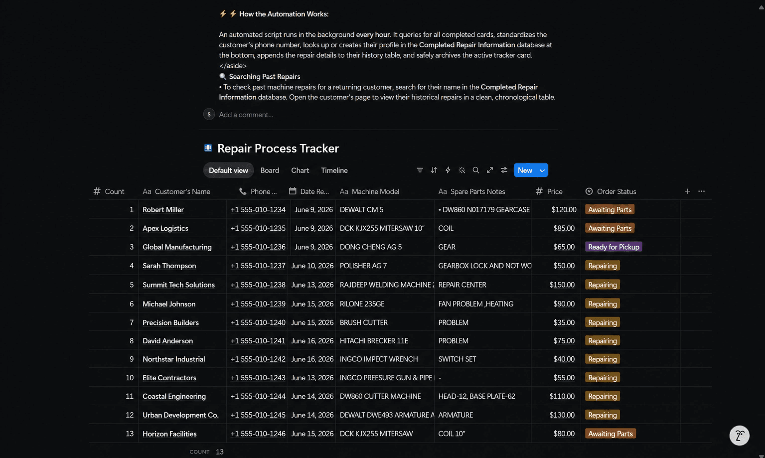
Three friction zones. Twenty wasted minutes. Every single repair.
The Context Switch
Every repair pushed the technician into a separate archive. More clicks, more errors.
The Race Condition
Notion's search index lagged for seconds, so duplicate profiles appeared before the first one registered.
The Spacing Bug
One trailing space made "Keshav Tile" two people. It silently split the history.
One page.
Two databases.
Zero manual steps.
Two databases, one page. Active repairs and customer archive, unified so technicians never leave the hub.
Then I made archiving invisible. No button, no form. It files itself the moment a status flips to done.
System architecture
Repair Hub Portal
One parent page, one source of truth
Database A, Active Tracker
Current pipeline, received to repairing to done
Database B, Customer Archive
Each card is one unique customer profile
Repair History Table
Nested per customer, a chronological machine log
Before
Six manual steps per repair
Constant switching between pages
Duplicate profiles piling up
Dirty data hiding real history
No guide for new staff
After
One action, flip the status to done
A single hub page, never leave it
A live cache that blocks every duplicate
Name cleanup on every write
A step by step guide built into the page
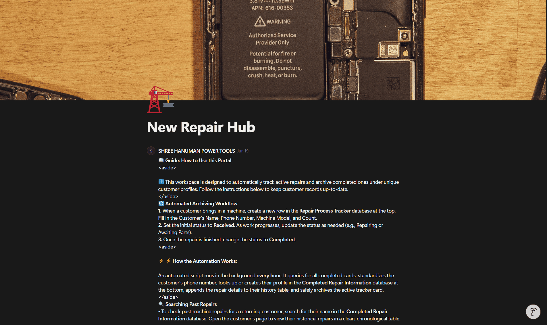
Customer archive, per profile view
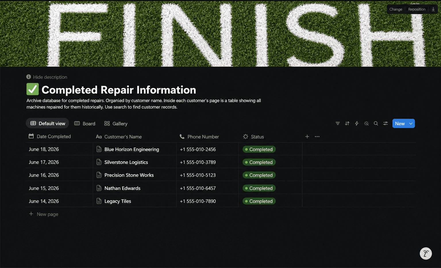
Per customer repair history table
What I owned, and what I handed off
Filled badges are my work. Outlined badges sat with the client.
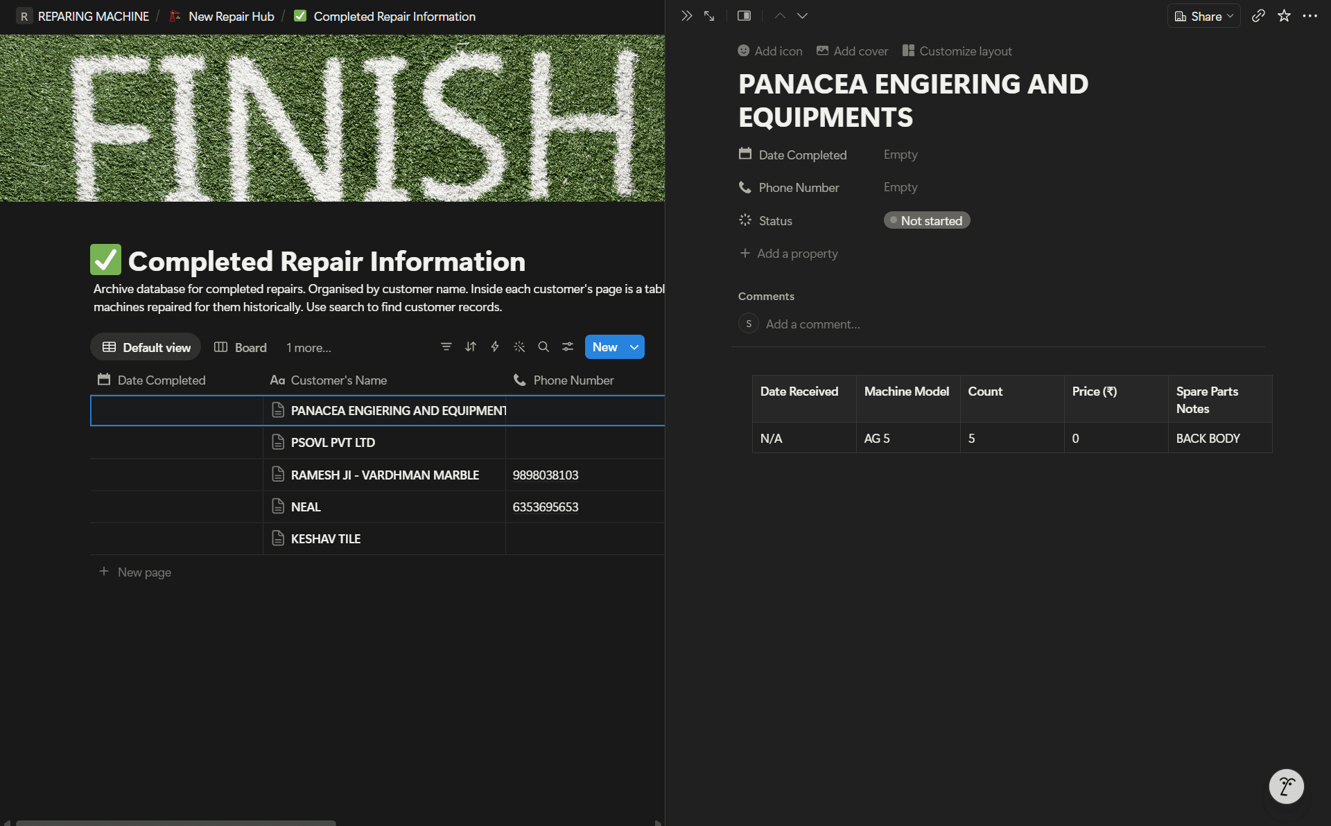
Hub portal, full operational layout
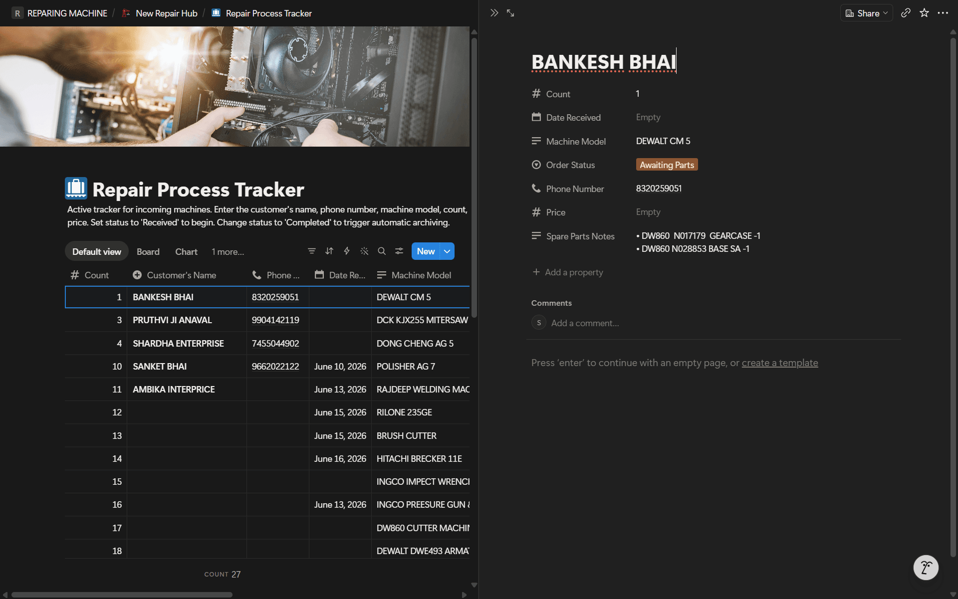
Background daemon, the live sync console
The best feature I designed is the one you never see. The automation that makes filing disappear.
The team closed their first repair on the new system without asking a single question.
Nobody needed training. Three staff, one technician, ten-plus machines a day — they just used it.
fewer admin steps on every completed repair
duplicate customer profiles since launch
from first observation to live system
to onboard new staff, down from days
Watching beats interviewing
The client never mentioned the problem. I found it by observing, not asking.
UX lives in the data layer
My most impactful decision was not a screen. It was a live cache that killed a race condition.
The best feature is the one you remove
Six steps became one. Every removed step is a removed failure point.