At a Glance
Three outcomes of the research and design.
4
Key findings
Discovery research reframed the whole problem from store to inquiry.
0
Payment gates
The checkout model routes through WhatsApp. One message, one conversation.
1
Visual system
Industrial black, zero radius, crimson accents. Every token decided once.
The shop was already closing sales. Just not online.
A six-year-old shop in Navsari, no website. Its customers, electricians and carpenters, were already buying over WhatsApp. Nobody had connected the two.
Tool buyers do not browse. They confirm, then message. So the cart is not a cart. It is an inquiry builder.
The old workflow for a customer
Call the shop during business hours
Describe what they need verbally
Wait for the owner to check stock
Negotiate price over the phone
Drive to the shop or arrange pickup separately
I did not start in Figma. I started by watching the shop run.
The question shifted fast: from "build an online store" to "reduce friction between intent and inquiry."
Contextual Inquiry · Stakeholder & User Interviews · Competitive Analysis · Brand Exploration
Assumptions, tested against reality
Customers want to complete purchase online
Invalidated. Inquiry preferred.
WhatsApp is a secondary channel
Invalidated. It is the primary channel.
Price display builds trust
Partial. They want to negotiate, not see fixed price.
Authorized dealer status is assumed
Invalidated. Customers ask directly, repeatedly.
Mobile is the primary browsing device
Validated. All participants browsed on phone.
The purchase is a conversation, not a transaction
No one wanted a cart, payment, or address field. They confirm, then negotiate.
Replace checkout with an inquiry builder.
Trust is stated, not assumed
"Are you authorized?" That should be answered before any contact starts.
Surface dealer status on homepage, footer, and service page.
Off-hours, on mobile, is the real use case
"People message me at 6am before a job site." Decisions happen when the shop is closed.
The catalog must work fully at any hour, no human needed.
Brand and trade are the navigation axes
They search by trade, or a brand they trust. Not by price or best-seller.
Filter by trade and brand first. Price is secondary.
No tradesperson interviewed wanted to buy online. They wanted to confirm, then contact. That single insight replaced the entire checkout model.
Built in Figma. Structure before style, the flow mapped before a single color.
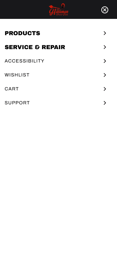
Desktop navbar, logo centered, search right
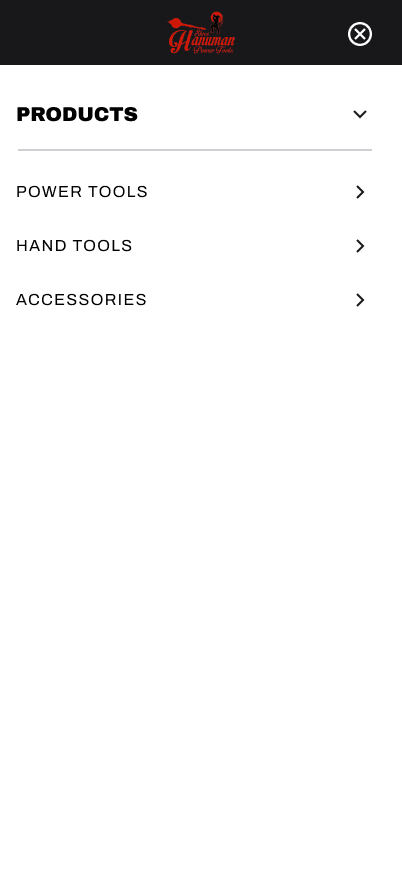
Navbar with product category dropdown
Mobile-first, one-handed browse

Homepage, mobile

INGCO brand filter, mobile

STANLEY brand filter, mobile
What does "authorized, local, and reliable" look like to someone who uses tools for a living?
Consumer e-commerce signals trust through softness. Tool buyers read a different vocabulary: precise, heavy, local.
Color direction, three explored
A. Black + Amber
Rejected. Reads as "under construction."
B. Navy + White
Rejected. Reads as consulting, not a tool shop.
C. Black + Crimson
Selected. Authority without shouting.
Typography, four pairings tested
Bebas Neue + Inter
Energy drink, not tools.
DM Sans + DM Mono
Too generic. Any SaaS.
Oswald + Source Sans
Softens under tracking. Reads as news.
Archivo Black + Inter ✓
Selected. Workshop signage weight, no lifestyle read.
System constraints, locked after exploration
Before
Customers called during business hours to ask about stock
Owner described products verbally with no reference point
No way to browse by brand, trade, or category
WhatsApp inquiries arrived with no context
No digital record of stock or authorized brands
After
Customers browse the full catalog at any hour, filtered by brand or trade
Each product page shows specs, brand, and category before contact
The inquiry cart pre-fills a WhatsApp message with items and quantities
The owner receives structured inquiries instead of cold calls
Authorized dealer status is visible on landing, footer, and service page
What I owned, and what the client provided
Filled badges are my work. Outlined badges were provided by the client.
The research answered the big question. It raised sharper ones.
The questions I would test next with real users.
Questions worth testing
Do customers send the pre-filled message as-is, or edit it first?
Does the visual system signal "authorized dealer" on its own?
Is there a path from a warranty question back to browsing?
Does an empty filter result create distrust about stock?
Delivered as a research and design-system handoff.
The engagement closed with four validated findings, a documented visual system, and the wireframe directionin the owner's hands. The build hasn't started yet — but the next step no longer needs a discovery phase. When the shop goes digital, the decisions are already made.
The channel is the product
The owner already sold on WhatsApp daily. The answer was not a better checkout. It was to hand off to WhatsApp.
A visual system is a decision engine
Zero radius. Zinc-950. Archivo Black. Decided once, applied everywhere.
Research reframes the brief
I was asked for a store. The research said: build an inquiry, not a checkout.